What is a red state and what's a blue state? The concept came into vogue in the 2000 elections. States which voted for Gore were blue states, while red states voted Bush. This shorthand description glosses over a lot of important fine detail. In truth, there are no fully red and fully blue states. Although a given state's slate of electors may go fully to the winner of an election, the entire voting population doesn't vote for one or the other candidate. Additionally, maps which show the geography of a country don't accurately portray the population density of the country. The proportion of red to blue states shown on a traditional map is frequently misleading concerning the breadth of support for a given candidates. There are ways, pretty ways, of drawing maps to correct for these two problems.
Purple States
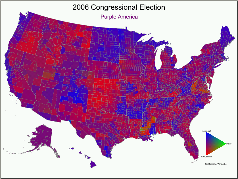
Robert J. Vanderbei produces maps which display, county by county, the "color" of a district. Democrats are blue, and Republicans are red, but the color for a given county is a mixture of blue and red in proportion to the votes cast for Democrats and Republicans. The resulting map displays a bunch of purples with occasional splotches of reddish and bluish areas. It looks like the area around Kansas City in the above map is pretty thoroughly blue. I wouldn't be surprised if this were the McCaskill Effect.
Vanderbei's compiled other maps for other elections, and currently has on his site an animated gif showing a series of such maps for the presidential elections from 1960 to 2004.
Funky States
The second problem with these maps is that they misrepresent the size of an area's voting population. That is, a state may be geographically large and therefore big on the map while having a small population. If one looks at a map of the 2004 election results, for example:
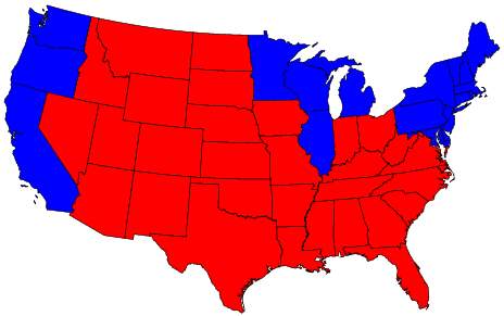
one thinks that America is really quite predominantly red, with a few pockets of blue in selected areas. This is deceptive, however, because many of those red states are less populous than many of those blue states. Wyoming's bigger than Pennsylvania on the map, but in reality has a much smaller population. The picture looks like a landslide, the election itself was close.
Michael Gastner, Cosma Shalizi, and Mark Newman suggest that a better way to represent the data is through use of cartograms. A cartogram distorts the geography of the map so that the area taken up by a state in the image is proportional to its population. If you've looked at the NYTimes election maps, this should be familiar. If one creates a cartogram of the 2004 presidential election results, one gets a map that looks like this:
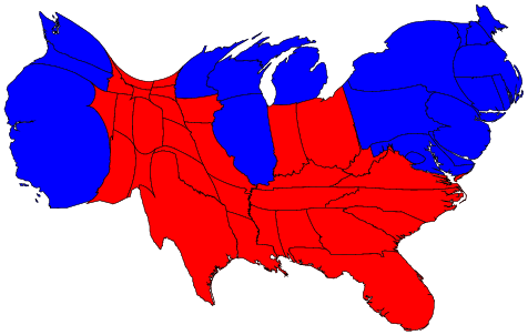
The red seems far less dominant in this image. Now, remember how the purple state maps showed results on a county-by-county basis? GSN do the same with the cartogram approach, representing the population of each county by its size in the map. Whats more, one can combine this cartogram approach with the purple shading approach to create a map in which counties' images are sized in proportion to their population and are colored in proportion to the vote breakdown. Here are the results of the 2004 presidential election using this approach:*
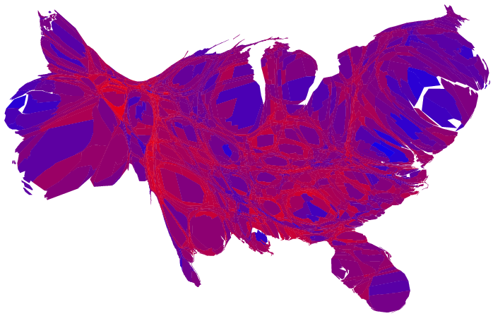
The results are lovely, and demonstrate the reality of the situation. People all over the nation have different political beliefs. One can't truly call a state a red state or a blue state because the people in it hold a variety of beliefs and vote for both parties. There is no red America and no blue America, there's just a splotchy purple America.
*GSN's 2006 elections page doesn't have quite the same sort of map, but is still well worth a look.
2 comments:
I don't know. The last map looks more like three day old santorum mixed with some funky grape jelly.
If your santorum looks like that, medical attention is promptly required.
Post a Comment